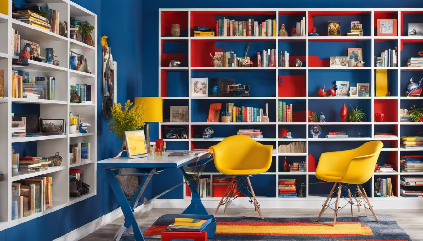
You might be surprised to know that the colors you choose for your home can significantly impact productivity levels. The aesthetic appeal of brand colors not only influences the look and feel of your space, but it can also play a crucial role in creating an environment that fosters creativity, focus, and energy. Let’s dive into how the right color choices can transform your home into a more productive and inviting space.
When it comes to creating a productive home environment, the influence of brand colors on culture, marketing, and products cannot be underestimated. These colors have the power to evoke specific emotions and associations, which can ultimately affect your overall productivity and well-being. For instance, colors like yellow are known for boosting energy and optimism, while greens signify stability, growth, and a connection to nature.
In my experience, choosing the right color palette for your home is essential in crafting a space that helps you stay focused and motivated. From striking a perfect balance between comfort and efficiency to enhancing your workflow and mood, the strategic use of brand colors in your home can lead to remarkable productivity benefits. So, why not give your surroundings an upgrade with thoughtful and intentional color choices? Your future productive self will thank you!

Understanding Color Psychology
Have you ever wondered why certain colors make you feel a certain way? Color psychology is the key to unlocking these emotions and using them to create a productive home environment. Let’s dive into how colors affect our mood, and how we can use them to enhance our homes.
Blue is often associated with trust, security, and serenity, making it an ideal color for creating a calm setting in spaces like your living room or bedroom. On the other hand, red is considered a powerful and bold color that evokes feelings of passion, energy, and even danger, which can add excitement to specific areas in your home.
Green is reminiscent of nature and growth, inducing feelings of balance, health, and harmony. It works well in rooms where you want to promote creativity and focus, while white represents purity and simplicity, offering a sense of cleanliness and organization. In contrast, yellow is all about fun, happiness, and optimism, inviting positive energy and a vibrant atmosphere.
Black is often seen as a luxurious and sophisticated color, whereas orange and pink carry warmth and playfulness, respectively. Different shades of gray can bring about a sense of neutrality, balance, and modernity. With various shades and combinations of these colors, you can create a tailored, emotional response in each room of your home.
Understanding the psychology behind color can be a personal and transformative experience. In my own home, I found that incorporating calming blues and greens into my office space tremendously improved my focus and productivity.
When selecting colors for your home, pay close attention to your emotional reactions and personal preferences, as these will ultimately dictate the mood and atmosphere you want to cultivate. By utilizing color psychology, you can create a space that not only looks visually appealing but also caters to your specific needs and feelings, giving you a truly personalized and harmonious living environment.

Importance of Choosing the Right Color Palette
Did you know that colors have the power to influence emotions and productivity? A well-chosen color palette can transform your home into a motivating environment. Let’s dive into the essentials of picking the perfect colors for an efficient living space.
Strategically selecting a color palette can foster a sense of simplicity, reliability, and invigoration. For instance, brown is associated with a grounding and stable feeling, while gold conveys luxury and ambition. Blues, in shades ranging from light blue to dark blue, are known for their calming effects, and when implementing these hues, productivity can soar.
Experimenting with different color schemes can lead to a variety of results. With monochromatic color schemes, consistency and focus are emphasized, as you have one dominant color with different shades and tints. On the other hand, analogous colors utilize neighboring hues on the color wheel, offering a more diverse yet harmonious feel.
In my experience, choosing the optimal color palette relies on understanding your personality and the desired emotional impact. Settling on a mixture of bold and neutral colors can enhance the overall atmosphere, making your home both visually appealing and conducive to productivity.
Ultimately, it’s essential to balance colors, shades, and hues that resonate with your taste and foster a sense of well-being. Remember, your home is your sanctuary, and the right color palette will not only inspire productivity but also create a space that nurtures, motivates, and comforts you.
Role of Colors in Branding
Did you know that colors play an essential part in the success of your brand? That’s right, the right combination of colors can make a difference in how your business is perceived. Let’s take a dive into the impact of colors in branding and marketing activities.
Colors are a fundamental element in branding, as they shape your brand’s personality and influence your target audience’s perception. Be it in your logo, website, or even marketing materials like ads and packaging–colors can evoke emotions and psychological reactions. In my experience, choosing the right color palette can create a great visual identity for your company, setting it apart from competitors while attracting potential customers.
In the world of art and design, colors play an integral role in conveying ideas and messages. When working on your brand identity, selecting the right colors ensures that the design reflects your brand’s vision and values. For instance, red represents power and excitement, whereas blue symbolizes reliability and trustworthiness. Aligning your brand’s color scheme with these attributes can result in a cohesive and recognizable brand image.
Color psychology in marketing is a valuable tool to create engaging ads. Using specific colors can affect consumers’ feelings, responses, and decisions. For example, a study showed that red triggers appetite and attention, making it a popular choice for food packaging. Bright colors like yellow and orange are also likely to catch the eye, driving sales and web traffic.
Your brand colors can impact how you stand out among competitors and foster brand recognition. By selecting a unique, striking color scheme, your company can rise above the competition in the consumers’ minds. Additionally, consistent use of these colors across all mediums, from your logo to your website, will ensure a unified, recognizable presence in the market.
Keep in mind that colors can convey different meanings depending on cultural factors. Conducting thorough research on your target audience’s preferences and associations can help in formulating an effective color scheme that resonates with them.
In conclusion, a well-thought-out color palette can greatly enhance your brand’s presence and create positive associations in your target audience’s minds. Considering the importance of colors in branding is essential when crafting a successful brand identity, ultimately boosting sales and customer loyalty.
Impact of Culture on Color Preference
You might be wondering how color preference is influenced by something as complex as culture. Well, buckle up, because we’re about to take a deep dive into this fascinating topic. Let’s explore how different aspects of culture, such as values, religion, mourning, celebration, and nationality, affect the way we perceive and react to colors.
Culture plays a significant role in shaping an individual’s color preferences. Our values can be deeply ingrained in our reactions to specific colors. While the Western world often associates green with growth and prosperity, this color can signify jealousy or infidelity in other cultures. So, when choosing productive brand colors for your home, it’s essential to consider the core values of your target demographic.
Religion is another crucial factor that influences color perception. For example, Christianity often associates blue with the Virgin Mary, while Hinduism uses the same color to represent Krishna, a central deity. When selecting brand colors to inspire productivity in your home, be mindful of how those colors may be associated with various religious beliefs or spiritual practices.
In many cultures around the world, the perception of colors during mourning and celebration can vary significantly. In Western cultures, we commonly associate black with mourning, while white is symbolic of innocence and purity. In contrast, many parts of Asia view white as a somber color, often worn during funerals. On the flip side, during festive occasions, red is considered a joyful and auspicious color in many Eastern cultures. This knowledge is vital when choosing productive brand colors that cater to diverse emotional or cultural needs.
Lastly, our color preferences can be influenced by nationality and pride. For instance, appealing to an American audience may involve incorporating red, white, and blue, which are synonymous with the nation’s flag. On the other hand, if you’re aiming for a Canadian demographic, red and white would be the colors of choice. National pride can have a significant impact on how colors are perceived, and embracing it can make your home feel more welcoming and productive.
In my experience, understanding the diverse cultural influences on color preferences can make or break the effectiveness of your home’s brand colors. By taking into account the different values, religious beliefs, mourning, and celebration practices, as well as national pride, you can select the perfect palette to create a productive and personalized environment.
Colors in Business Through Notable Examples
Have you ever wondered why some brands effortlessly catch your attention and remain in your memory? A major part of their allure lies in their use of colors, which have been carefully selected to evoke a specific mood and showcase the brand’s identity. This section provides a quick glance at how renowned brands such as Nike, Starbucks, and Coca-Cola have leveraged colors to enhance their products, services, and missions.
Nike has become synonymous with inspiration and success across the athletic world. In my experience, the famous brand’s Swoosh logo, featuring a striking black color, is an undeniable symbol of style, power, and agility. Paired with a backdrop of bold, unconventional colors in their products, Nike successfully communicates a sense of energy and motivation.
Starbucks, on the other hand, aims to create a warm and friendly atmosphere for its customers’ café experience. The brand’s signature green color reflects a sense of reliability and an association with nature, which, when coupled with the brand’s logo, results in a memorable and enduring identity. This color choice also complements Starbucks’ mission to source ethically and environmentally responsible coffee beans.
When it comes to Coca-Cola, the connection between the brand and its bright red color is almost automatic for most people. According to research, the use of red elicits feelings of excitement, passion, and urgency, which are all emotions that Coca-Cola capitalizes on to engage its customers. The brand’s consistent use of the color red in both its logo and products has resulted in an almost universal association between the hue and the company.
These specific examples demonstrate the power of color in creating and maintaining a distinct brand image, while also influencing how people perceive different products and services. By strategically selecting colors that communicate their message, brands like Nike, Starbucks, and Coca-Cola have managed to gain their customers’ trust, establishing themselves as industry leaders.


