In today’s visual-centric digital world, a strong and eye-catching color palette can make or break a brand’s image. Think about it – when you see that familiar shade of blue, don’t you instantly recognize Facebook? Applying the allure of vintage color palettes to your brand may just be the next big trend in strategic design.
As a marketer, I’ve noticed that incorporating timeless, classic colors can evoke a sense of nostalgia, trust, and familiarity in consumers. This can lead to a stronger connection with your audience, and ultimately boost your brand’s success. Here’s a little secret: it’s not at all difficult to integrate these vintage palettes into your branding strategy.
To get started, let’s dive into the world of vintage brand color palettes and bring your brand’s visual identity to new heights. From exploring inspirations from iconic decades to understanding the nuances behind various color schemes, you’ll soon discover that a vintage palette can transform your brand’s visual impact and help your brand thrive in the dynamic marketing landscape.
Exploring Vintage Brand Color Palettes
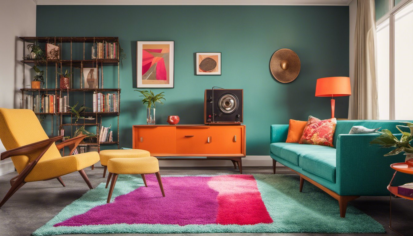
Vintage brand color palettes? They’re more than just “old school” shades. They’re a deep dive into the visual DNA of past eras, revealing the mood, vibes, and cultural shifts of the times. Think about it: the soft pastels of the 1950s weren’t just colors; they were echoes of post-war optimism. And those bold, in-your-face hues from the ’60s and ’70s? Pure countercultural energy.
Fast forward to today. It’s no secret that the digital marketing and design space loves a good throwback. And why not? There’s a goldmine of inspiration in these classic palettes. Whether it’s in reimagining a retro logo or giving a website design that nostalgic touch, tapping into vintage colors isn’t just about aesthetics. It’s about leveraging the emotional resonance of bygone eras. In short: these aren’t just colors. They’re stories, waiting to be retold in today’s digital landscape.
Decoding The Color Palette
Ever wondered why certain color combinations just feel right? It’s time to unlock the mystery! In this section, we’ll reveal the secrets behind choosing vintage brand color palettes that not only look stunning but also convey your brand’s message effectively. Strap in and let’s dive into the world of colors, hex codes, and all things vintage.
Colors play a significant role in shaping the identity of a brand. Vintage color palettes often comprise of warm, muted tones that evoke a sense of nostalgia and comfort. Think of burnt orange, sepia, rose gold, and teal – these shades bring to mind memories of bygone eras, making them a go-to choice for brands looking to establish a retro, timeless feel.
The key to decoding a vintage color palette lies in understanding the color theory and selecting colors that complement each other. When planning your color scheme, keep in mind the balance between primary, secondary, and tertiary colors. This harmony can create a visually pleasing and coherent effect, making your vintage brand stand out from the crowd.
Remember, in addition to color selection, hex codes play an essential role in maintaining consistency across digital platforms. These six-digit codes represent the precise value of a color and ensure that your vintage color palette remains consistent throughout your branding and marketing efforts. For example, the hex code #A0E7E5 corresponds to a refreshing Tiffany blue shade often found in vintage design.
In my experience, experimenting with different vintage color combinations can be both fun and challenging. But armed with the knowledge of color theory and a wise selection of hues, you’ll be able to create a mesmerizing vintage brand color palette. To make it even easier, consider using a Color Palette Generator to get started.
So there you have it – the primary components of a vintage brand color palette decoded! With the right mix of colors and consistency through hex codes, you can create a distinctive and memorable identity for your vintage brand. Now go out there, and let your colors shine!
Seasonal Color Palettes
You’ve just stumbled upon a goldmine of vintage color inspiration. Imagine the captivating aesthetics that will set your brand apart. Join me as we dive into seasonal color palettes that evoke the perfect vintage vibe, regardless of the season!
Summer Blend is a refreshing color palette inspired by endless days spent basking in the warm sun. This combination of cool greens, soft blues, and invigorating yellows captures the essence of a picture-perfect summer day. Besides the obvious connection to nature, this palette also brings a nostalgic feel reminiscent of poolside parties and ice cream truck tunes. Add this summer blend to your designs, and let everyone experience the magic of a long, carefree summer day.
Take a trip to the tropics with the Sunset Coral palette – a vibrant mix of warm oranges, pinks, and purples. These colors are reminiscent of a breathtaking beachfront sunset that you might’ve witnessed on a vintage postcard or Instagram feed. The striking contrast of these shades can catapult your project into a realm of bold and daring vintage greatness. Don’t miss out on making a statement with this fabulous color scheme!
As the sun sets, the Coral Reef palette comes to life. This unique combination of pastel pinks, soothing blues, and muted greens mirrors the ethereal beauty of coral reefs. Just like diving beneath the ocean’s surface, incorporating this color palette into your designs transports you to another world – a world filled with vintage charm and whimsical wonder. Why not dive in and let the Coral Reef palette create an unforgettable visual experience for your audience?
Whether you’re into the cool hues of the Summer Blend, the striking warmth of Sunset Coral, or the enchanting tranquility of Coral Reef, these vintage seasonal color palettes are waiting to elevate your design game. So go on, experiment with combinations, and immerse yourself in the captivating world of vintage brand color palettes. The perfect seasonal touch that your designs deserve is only a few clicks away!
Neutral Color Palettes
Imagine walking into a room that immediately feels soothing and inviting. That’s the power of a well-balanced neutral color palette. In this section, we’ll explore how to create vintage-inspired neutral color palettes that can add a timeless elegance to your brand. So, let’s dive into the beautiful world of neutrals.
Neutral colors don’t just mean whites, browns, and grays. You can also consider other colors as neutrals in the right setting. For example, you can use a sage green or a chalky yellow as a neutral by pairing these muted tones with other neutrals like bright white, cream, or light gray.
One way to create a vintage brand color palette using neutrals is to combine neutral colors with pastel shades. This will give your brand a soft, nostalgic feel that’s perfect for a vintage aesthetic. Here’s an example of a neutral vintage color palette:
- Light Blue: A soothing and tranquil shade, creating a peaceful atmosphere.
- Cream: A warm and inviting color that adds a touch of elegance.
- Tan: A versatile neutral that pairs well with other soft colors.
- Dusty Yellow: Evoking memories of the past, with a hint of sun-drenched warmth.
- Brown: Adding depth and grounding to the palette.
In my experience, using textured or distressed finishes can enhance a neutral vintage color palette even further. This can help your brand design feel authentic and lived-in, tapping into the nostalgia that comes with vintage styles.
Another approach to creating a vintage neutral color palette is to focus on different shades of the same base color. Monochromatic schemes with soft tints and shades evoke a sense of calm and timeless elegance. For example, working with different shades of blue can produce a sophisticated, harmonious look:
- Smoke Blue: A subtle and sophisticated shade that adds depth.
- Powder Blue: A light, gentle hue that conveys a soft vintage charm.
- Sky Blue: A slightly brighter color that adds a refreshing touch to the palette.
Of course, you can always mix and match these ideas to create a unique and memorable vintage neutral color palette for your brand. The key is to experiment and find the perfect combination of colors that both evoke a nostalgic, timeless feel and resonate with your target audience.
Sourcing Your Color Inspiration
Ever struggled to find the perfect color scheme for your vintage branding project? You’re not alone. Many designers face the challenge of discovering a harmonious palette that resonates with their audience. In this section, we’ll explore some valuable resources and techniques for sourcing your color inspiration.
One helpful place to start is by visiting a curated collection of vintage color palettes, like the ones found on the 99designs blog. These collections provide a great starting point to spark your imagination and browse through expertly selected color combinations.
In addition to curated collections, you can also find inspiration by using online tools such as the color palette generator from HubSpot. This tool helps to deliver several full-color palette options that add neutral tones to your primary and complementary colors. Best of all, you can customize each palette to fit your unique brand identity.
Don’t underestimate the power of social media when it comes to discovering beautiful color schemes. Utilize platforms like Instagram to explore vintage color palettes shared by other designers. Instagram is an abundant resource for visual inspiration and color schemes that you may have never even considered before. Follow hashtags related to vintage design and color inspiration to keep your feed filled with creative ideas.
In my experience, one underrated source of color inspiration is to draw from your own personal memories and experiences. Think about the colors that have resonated with you throughout your life, whether it be from a memorable trip or a childhood toy. Connect with these emotions to develop a color scheme that not only has personal significance but also can evoke a strong emotional response from your audience.
Remember, when sourcing your color inspiration, explore various resources like curated collections, color palette generators, and social media platforms like Instagram. Making use of these tools and connecting with your personal experiences will help you create a beautiful, cohesive, and emotionally resonant vintage palette for your branding project.
The Sixties and Beyond
Ready to step back in time? The vintage brand color palettes of the sixties brought out a whole new level of groovy designs that still inspire designers today. In this section, we’ll explore the unique color palettes that defined this iconic decade, along with the sense of peace and freedom that it embraced. Let’s dive in!
The 1960s introduced a vibrant and colorful era in fashion, with an undeniable sense of freedom and self-expression. One notable trend was the rise of bold, psychedelic patterns that incorporated bright, unexpected color combinations, very much reflecting the groovy movement of the time. In addition, fashion icons of the time, like Twiggy and Mary Quant, embraced the mini-skirt, which quickly became synonymous with the decade.
During the sixties, color palettes stretched beyond fashion, leaving their mark on architecture and design as well. Rich, jewel tones were prevalent in the previous decades, but the sixties brought about a shift towards more laid-back and nature-inspired hues. For example, shades of green became popular, symbolizing the peace and environmental focus that was gaining momentum during that time.
In my experience working with vintage designs, I found that to truly capture the essence of the sixties, a blend of these nature-inspired colors, along with some vibrant, contrasting tones should be used. It is this combination of earthy and vivid colors that truly captures the spirit of the decade.
One quintessential 1960s color palette could include burnt orange, lime green, turquoise, and hot pink – a striking mix that values both the boldness of the groovy movement and the subtler, more serene aspects of peace and freedom. This combination not only transports you back to the age of vinyl records, but also provides a stepping stone for creatively integrating these hues into modern design trends.
In conclusion, embracing the unique, colorful blend of vintage brand color palettes from the sixties can truly transform your designs and help create a sense of nostalgia. Don’t be afraid to experiment with these groovy shades and let your creativity run wild as you explore the power of color in bridging the gap between decades. And remember, just like the sixties, the key is finding a harmony between bold patterns and a sense of peace and freedom to make your designs truly stand out.
Using Vintage In Branding
Have you ever wondered how vintage brand color palettes can skyrocket your sales? Astonishingly, using colors with a touch of history can evoke trust and reliability in your brand. Let’s explore the magic of vintage in branding and graphic design.
When it comes to branding, your brand colors play a crucial role in creating a memorable and lasting impression on your audience. Vintage color palettes often have a sense of familiarity and time-honored values, which can lead to an increased perception of trustworthiness. Integrating these palettes into your graphic design and logo can help your brand stand out in a crowded market by showcasing your commitment to quality and tradition.
Incorporating vintage brand color palettes into your branding strategy can lead to a higher level of sales and brand recognition. Combinations of classic colors trigger feelings of nostalgia and authenticity, tapping into your target audience’s emotions and increasing their likelihood to engage with your brand.
While working with a family-owned business, I found that by using vintage color schemes in their logo and marketing materials, their brand became synonymous with decades of experience and tradition. This subtle adjustment in color choice turned out to be a game-changer for their sales and brand image.
Remember, the key is to select colors that resonate with your brand’s essence and values while invoking a sense of history. Forge a stronger connection with your audience and harness the power of vintage brand color palettes in your branding and graphic design strategy. And watch as your brand’s identity and recognition soar to new heights.
Sharing Vintage Color Palettes
Are you looking to revitalize your brand with a touch of nostalgia? Vintage color palettes can help you achieve that classic look, plus they are easier than ever to access, save, and share. Let’s dive into how you can explore and utilize these palettes while infusing a retro vibe into your designs.
The first step is knowing where to find the perfect vintage palette for your brand. Websites like Canva have a plethora of vintage-inspired palettes available, complete with HEX codes. Once you’ve found the ideal color scheme, save it to your computer or pin it to a Pinterest mood board for future inspiration.
Speaking of Pinterest, it’s an excellent platform to discover, save, and share vintage color palettes with like-minded designers. Use the platform’s search feature to explore various palettes, and when you find one you like, simply hit the “Pin it” button to save it on your board. This way, you can easily access the palettes every time you need a splash of vintage inspiration.
Now that you have your vintage color palette on hand, it’s time to apply it to your designs. If you’re using Adobe software, you can download retro swatches from websites like Shutterstock, making it effortless to apply the colors to design elements. For non-Adobe users, paste the HEX codes from the palettes into your design program of choice.
Sharing your newly-created vintage designs is essential to gaining recognition and exposure. To do this, leverage social media platforms such as Facebook, Instagram, and Twitter. Not only can you show off your work, but you can also engage with others who share a similar passion for retro designs. And don’t forget to include appropriate hashtags to reach a larger audience.
In my experience, embracing vintage color palettes can breathe new life into a brand and attract a whole new demographic. So, go ahead and explore the world of nostalgia, save those vintage palettes you adore, and share your beautiful designs with the world. Happy designing!
Color Palettes and Products
Did you know that a well-chosen vintage color palette can bring nostalgia and charm to your brand? That’s right! Let me show you how to use retro colors like sepia and sage in your products to create an alluring visual experience.
The first step is understanding the importance of vintage color palettes. These colors are reminiscent of the past and can easily evoke feelings of nostalgia, warmth, and sentimental value. Sepia, for example, is a classic, brownish tone that reminds us of old photographs and adds a sense of history to any design. On the other hand, sage green, with its earthy and calming hue, can bring a touch of tranquility and natural elegance to products.
Incorporating these vintage colors in your product design can be a game-changer. Take packaging, for instance. Packaging with a retro color palette immediately grabs attention and sets your brand apart from competitors. Think about how a product packaged in sepia and sage might appeal to consumers. It conveys a sense of heritage, sustainability, and even environmental mindfulness. All of these messages can make for a powerful marketing tool.
In my experience, using vintage brand color palettes extends beyond packaging. Your website, marketing materials, and even store interiors benefit from these delightful shades. By applying sepia and sage in your web design, you can create a website that feels familiar, inviting, and cozy to visitors. Likewise, adding these nostalgic colors to marketing materials like posters, brochures, and business cards can evoke a sense of trustworthiness and reliability, something customers value.
Let’s talk about incorporating vintage colors into the actual products themselves. A product with a sepia or sage finish can create an emotional connection between the customer and the item. For example, a clothing line that uses sepia-colored fabrics or sage accent pieces represents a timeless, classic appeal that never goes out of style. This can make customers feel like they’re investing in a high-quality, long-lasting product.
To sum it up, vintage brand color palettes, like sepia and sage, have the power to evoke emotion and create a strong brand presence. Whether it’s through packaging, marketing materials, web design, or product design, these timeless colors captivate consumers, engage their interest, and leave a lasting impression. Tap into the magic of vintage colors and witness your brand thrive!
Forward-Thinking Vintage Colors
Ever wondered how to give your brand a timeless appeal with a touch of nostalgia? Look no further than forward-thinking vintage colors. In this section, we’ll explore how neon, vantage, and advantage play a role in crafting a memorable brand palette inspired by the past.
Neon colors took the design world by storm in the 1980s, bringing vibrant energy to logos, packaging, and advertisements. These electric hues captured the spirit of the decade, as they stood out against the more subdued tones commonly used in previous years. By incorporating neon shades into your brand color palette, you can evoke a sense of excitement, innovation, and retro-futurism that still feels fresh today.
On the other hand, vantage colors are often characterized by their muted, earthy, or pastel tones. Harkening back to the 1960s and 1970s, vantage colors exude a sense of nostalgia and warmth, while still appearing modern and sophisticated. Brands that aim to associate themselves with timeless elegance and understated sophistication can achieve this by leveraging vantage hues within their visual identity.
Taking advantage of vintage-inspired color palettes can provide your brand with a unique edge that creates an emotional connection with consumers. In my experience, clients often gravitate towards brands that trigger memories or evoke a certain era, as it helps them build a stronger association with that brand’s story and values.
When exploring vintage colors, don’t be afraid to experiment with bold combinations and juxtapositions. Pair neon colors with vantage shades, or create a striking contrast by using both cool and warm tones. Keep in mind that the key to a successful vintage-inspired brand palette is to strike a balance between historical influences and contemporary design sensibilities.
Incorporating forward-thinking vintage colors into your brand’s visual identity can help you create a memorable and lasting impression on your target audience. So, go ahead and let the past inspire the present, as you craft a colorful story fit for the future.